
Mix, taste, love.

BORU
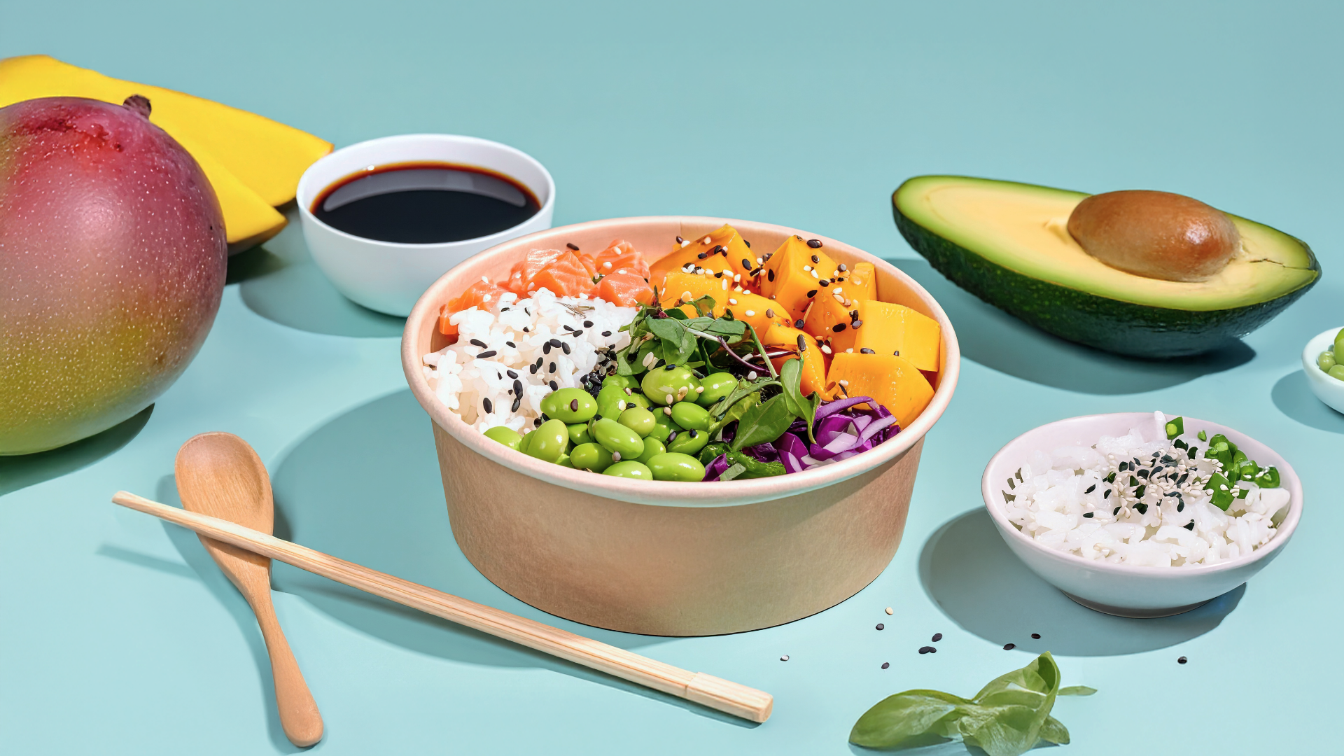
Poke Bowls
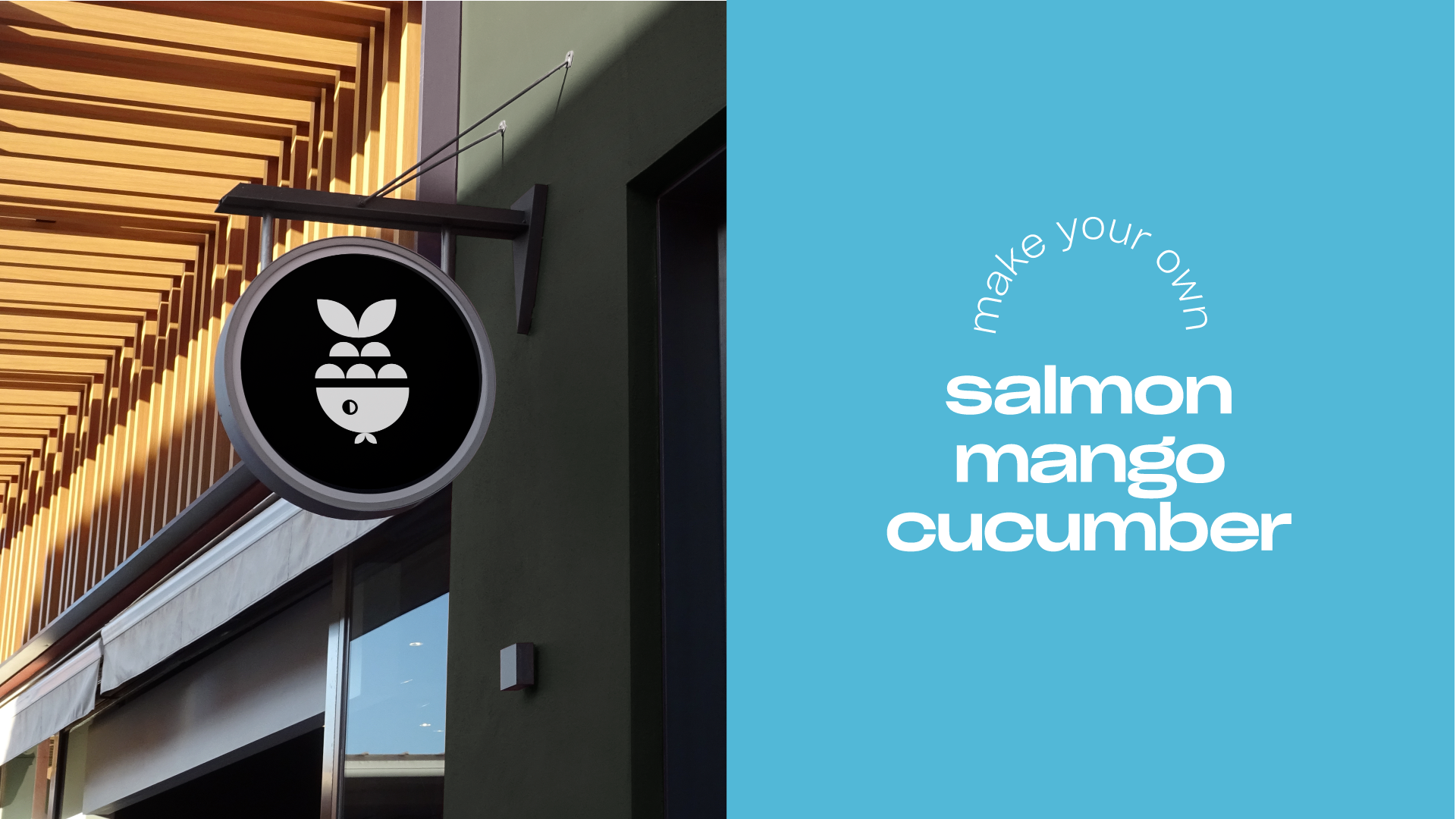
BORU is a fast casual restaurant with over 7 years in the market. Now, it seeks to evolve its visual identity to reflect the values and high standards it has achieved over time.
One of the brand’s core pillars is the freshness of its ingredients. Its dishes spotlight fresh seafood and vegetables, blending flavors in a unique and elevated way.
For this rebranding, we applied a refined update to the logo’s typographic style and evolved the existing color palette—introducing new tones that bring greater versatility and playfulness to the brand. We also introduced a product-inspired icon and a fresh, vibrant visual language—designed to enable more modern, cohesive communication that aligns with BORU’s long-term values and vision.
/ 2024


Color Palette
As part of evolving the color palette, we also aimed to create smoother and more harmonious color combinations. Instead of relying on black for text or the logo, we now use different tones from the palette to achieve contrast—resulting in a fresher, more contemporary look.


Project Scope
Branding & Packaging
Categories
Restaurant
Instagram
@boru.mx